Bits UI
Flexible, unstyled, and accessible primitives that provide the foundation for building your own high-quality Svelte component library.
At minimum, we recommend you read the following documentation before you start this integration guide.
Requirements
Introduction
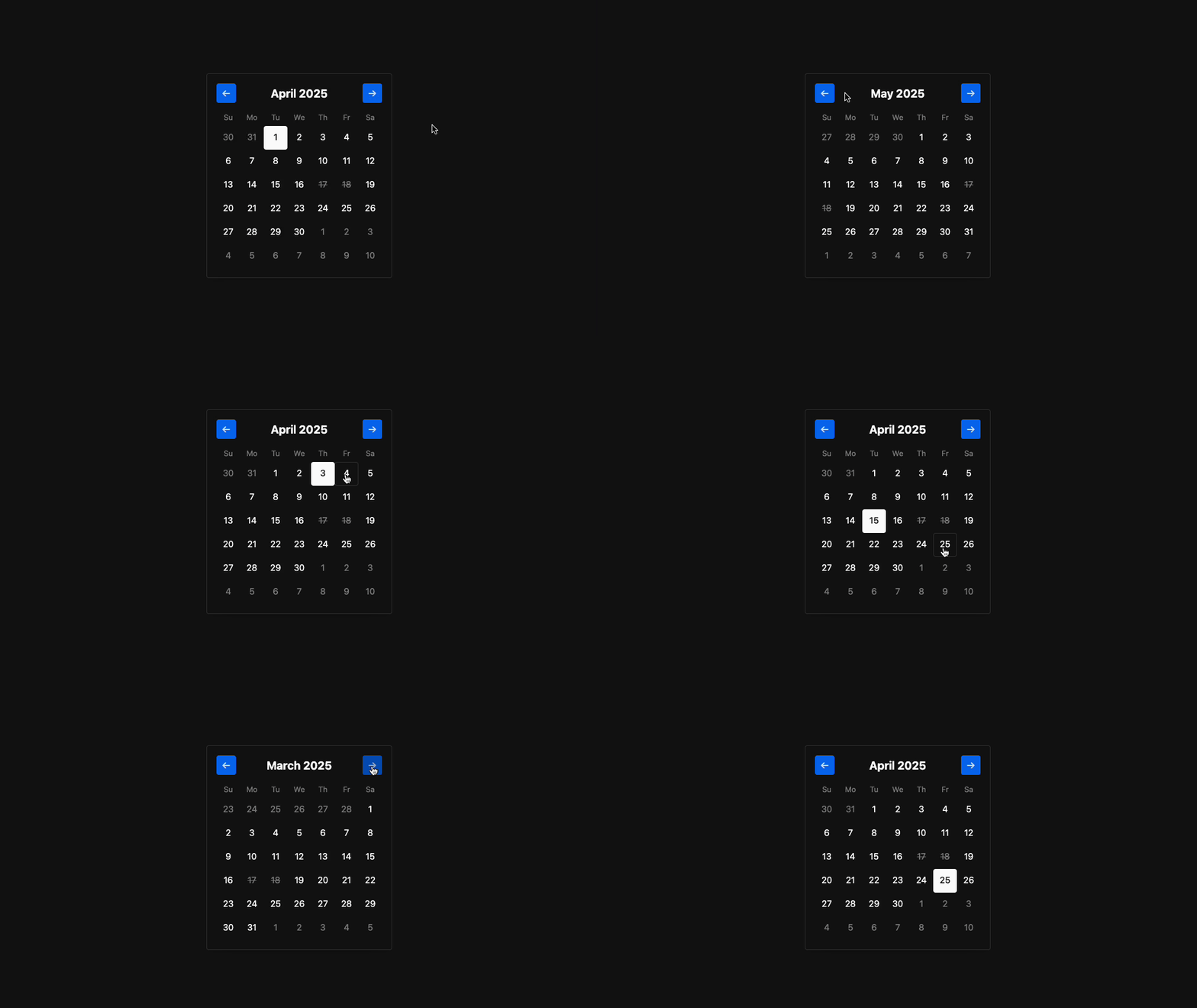
In this guide we'll implement the following Bits UI <Calendar> component. This will showcase the bare minimum requirements for integrating Skeleton with Bits UI.
Get Started
1. Create a SvelteKit Project
To begin, we'll setup a new SvelteKit project, including Skeleton v3 and Tailwind v4.
2. Install Bits UI
Install the Bits UI package via your package manager of choice.
npm install bits-uiWe'll also include the Adobe International Date package to assist with date/time formatting.
npm i -D @internationalized/date3. Component Boilerplate
Create a new component in /lib/components/Calendar/Calendar.svelte and insert the following markup. This will generate an unstyled version of the component.
<script lang="ts">
import { getLocalTimeZone, today } from "@internationalized/date";
import { Calendar } from "bits-ui";
const isDateUnavailable: Calendar.RootProps["isDateUnavailable"] = (date) => {
return date.day === 17 || date.day === 18;
};
let value = $state(today(getLocalTimeZone()));
</script>
<Calendar.Root {isDateUnavailable} weekdayFormat="short" fixedWeeks={true} type="single" bind:value>
{#snippet children({ months, weekdays })}
<Calendar.Header>
<Calendar.PrevButton>
<span>←</span>
</Calendar.PrevButton>
<Calendar.Heading />
<Calendar.NextButton>
<span>→</span>
</Calendar.NextButton>
</Calendar.Header>
{#each months as month}
<Calendar.Grid>
<Calendar.GridHead>
<Calendar.GridRow>
{#each weekdays as day}
<Calendar.HeadCell>
{day}
</Calendar.HeadCell>
{/each}
</Calendar.GridRow>
</Calendar.GridHead>
<Calendar.GridBody>
{#each month.weeks as weekDates}
<Calendar.GridRow>
{#each weekDates as date}
<Calendar.Cell {date} month={month.value}>
<Calendar.Day />
</Calendar.Cell>
{/each}
</Calendar.GridRow>
{/each}
</Calendar.GridBody>
</Calendar.Grid>
{/each}
{/snippet}
</Calendar.Root>4. Add the Component
Finally, let's add our new component to the root +page.svelte so that we may preview it.
<script lang="ts">
	import Calendar from "$lib/components/Calendar/Calendar.svelte";
</script>

<main class="p-10">
	<Calendar />
</main>
Styling
Each Bits UI component accepts a class attribute. Use this to provide Tailwind and Skeleton utility classes.
Basic Styles
Styling the <Calendar.Root> parent component.
<Calendar.Root
	class="card border-surface-200-800 bg-surface-50-950 mt-6 inline-block border p-4 shadow-xl"
>
	<!-- ... -->
</Calendar.Root>
Styling the <Calendar.PrevButton> sub-component. You can clone these to <Calendar.NextButton> too.
<Calendar.PrevButton
class="btn-icon preset-filled-primary-500"
title="Previous month"
aria-label="Previous month"
>
<span>←</span>
</Calendar.PrevButton>Styling the <Calendar.Day> sub-component.
<Calendar.Day
	class="hover:border-surface-200-800 data-selected:bg-foreground data-disabled:text-surface-600-400 data-selected:preset-filled data-unavailable:text-surface-600-400 group relative inline-flex size-10 items-center justify-center rounded border border-transparent bg-transparent p-0 text-sm font-normal whitespace-nowrap data-disabled:pointer-events-none data-outside-month:pointer-events-none data-selected:font-medium data-unavailable:line-through"
>
	<div
		class="bg-foreground group-data-selected:bg-background absolute top-1.25 hidden size-1 rounded-full group-data-today:block"
	></div>
	{date.day}
</Calendar.Day>
For the sake of time we won't cover every sub-component.
Complete Example
Below is a complete example showing the entire component with all styles and basic configuration.
<script lang="ts">
import { getLocalTimeZone, today } from "@internationalized/date";
import { Calendar } from "bits-ui";
const isDateUnavailable: Calendar.RootProps["isDateUnavailable"] = (date) => {
return date.day === 17 || date.day === 18;
};
let value = $state(today(getLocalTimeZone()));
</script>
<Calendar.Root
class="card border-surface-200-800 bg-surface-50-950 mt-6 inline-block border p-4 shadow-xl"
{isDateUnavailable}
weekdayFormat="short"
fixedWeeks={true}
type="single"
bind:value
>
{#snippet children({ months, weekdays })}
<Calendar.Header class="flex items-center justify-between">
<Calendar.PrevButton
class="btn-icon preset-filled-primary-500"
title="Previous month"
aria-label="Previous month"
>
<span>←</span>
</Calendar.PrevButton>
<Calendar.Heading class="text-lg font-bold" />
<Calendar.NextButton
class="btn-icon preset-filled-primary-500"
title="Next month"
aria-label="Next month"
>
<span>→</span>
</Calendar.NextButton>
</Calendar.Header>
<div class="flex flex-col space-y-4 pt-4 sm:flex-row sm:space-y-0 sm:space-x-4">
{#each months as month, i (i)}
<Calendar.Grid class="w-full border-collapse space-y-1 select-none">
<Calendar.GridHead>
<Calendar.GridRow class="mb-1 flex w-full justify-between">
{#each weekdays as day}
<Calendar.HeadCell
class="text-surface-600-400 w-10 rounded-md text-xs font-normal!"
>
<div>{day.slice(0, 2)}</div>
</Calendar.HeadCell>
{/each}
</Calendar.GridRow>
</Calendar.GridHead>
<Calendar.GridBody>
{#each month.weeks as weekDates}
<Calendar.GridRow class="flex w-full">
{#each weekDates as date}
<Calendar.Cell
{date}
month={month.value}
class="relative size-10 p-0! text-center text-sm"
>
<Calendar.Day
class="hover:border-surface-200-800 data-selected:bg-foreground data-disabled:text-surface-600-400 data-selected:preset-filled data-unavailable:text-surface-600-400 group relative inline-flex size-10 items-center justify-center rounded border border-transparent bg-transparent p-0 text-sm font-normal whitespace-nowrap data-disabled:pointer-events-none data-outside-month:pointer-events-none data-selected:font-medium data-unavailable:line-through"
>
<div
class="bg-foreground group-data-selected:bg-surface-50-950 absolute top-1.25 hidden size-1 rounded-full group-data-today:block"
></div>
{date.day}
</Calendar.Day>
</Calendar.Cell>
{/each}
</Calendar.GridRow>
{/each}
</Calendar.GridBody>
</Calendar.Grid>
{/each}
</div>
{/snippet}
</Calendar.Root>Going Further
If you wish to match Skeleton component conventions, view our contributor component guidelines.
Attribution
Bits UI is created and maintained by Huntabyte. Consider sponsoring him to support this open source project.